Since the US stock market bottomed in March 2009, it has been a commonly held belief that stocks have pretty much gone straight up with no looking back. Financial media has told us that this is now year nine of a “bull market.”
But before we get to poking holes in that narrative—let’s take a look at exactly what a bull market is. In theory, a bull market signifies that things are going up in value, and there is a clear uptrend.
How is that quantified? The most common threshold is a 20% increase in price. Conversely, a “bear market” is a 20% decline in price. But please know that 20% is an arbitrary number and does not hold any special statistical significance. It’s just how things have always been measured for the sake of identifying these two types of markets in the news.
Now that we got that out of the way, has the stock market really gone continuously up without a 20% decline since 2009?
Well, I will lean on All Star Charts to tell that story. They note that in 2011, the S&P 500 fell 19.38% on a closing basis—just shy of that 20% line in the sand. However, futures reached a drawdown of 22% and intraday did indeed breach 20%. Under the surface, stocks had a mind of their own too. Take the chart below as it compares underlying holdings to the index:
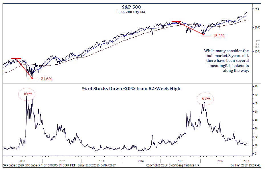
Source: Allstarcharts.com
I see two bear markets there. The decline in August 2015 is probably a bit fresher in people’s minds. It sure didn’t feel like a bull market to me when I watched in my office that Monday morning as the Dow dropped 1000 points at the open.
And remember, while the S&P 500 and Dow are the largest indexes, they are still just ones that represent US Large Caps. They actually fared best during this time. US Small Caps and International Developed had declines of over 20%, while Emerging Markets dropped over 30%.
So, you tell me—did these cumulative declines reset the infamous bull market?
Regardless, let’s play along and say we are still in that bull market from the 2009 bottom. The chart below makes that assumption and shows four major bull markets in US history:

Data as of: 3/8/2017; Source: Theirrelevantinvestor.com
The first glaring observation is that “hey, maybe we have a lot more room to run!” But to me, this also demonstrates just how difficult it is to sell at the top. Irrelevant Investor notes that 18 years ago, the Dow closed above 10,000 for the first time, despite some warning signs in a New York Times article that a crash could be in the cards. We all know what happened next—the great tech bubble.
Before it burst though, Michael Batnick astutely notes the following:
“But investors that decided to cash in their chips after reading this (excellent) article had to wait another 291 days before the market finally stopped going up. Over that time, the Dow rose 20%, which really isn’t a whole lot to miss out on, but the index that everybody cared about, the NASDAQ, went up another 120%!
The point is, even in the “most obvious” bubble of all-time, even with signs “clearly” showing the rally was running out of steam, investors needed heroic fortitude to not jump back in for one last swim. Calling the top is hard, really really hard.”
With a tip of the hat to baseball’s opening day: are we in the 9th inning of this current bull run? Extra innings?
The truth is that no one knows. At MarketStrats, we counter this by staying disciplined in our asset allocation and trading models. We don’t make adjustments to our investments off of feel, gut instincts, or for the heck of it. Until our data analysis says otherwise, this bull market trend is our friend.